A Designer and Creative Director located 20 miles north of Chicago and 1 mile west of Lake Michigan. Yes, the suburbs. Yes, a Subaru and a Golden Doodle. Also, currently an SVP Design Director at Leo Burnett.
Scroll down for a selection of projects ↯
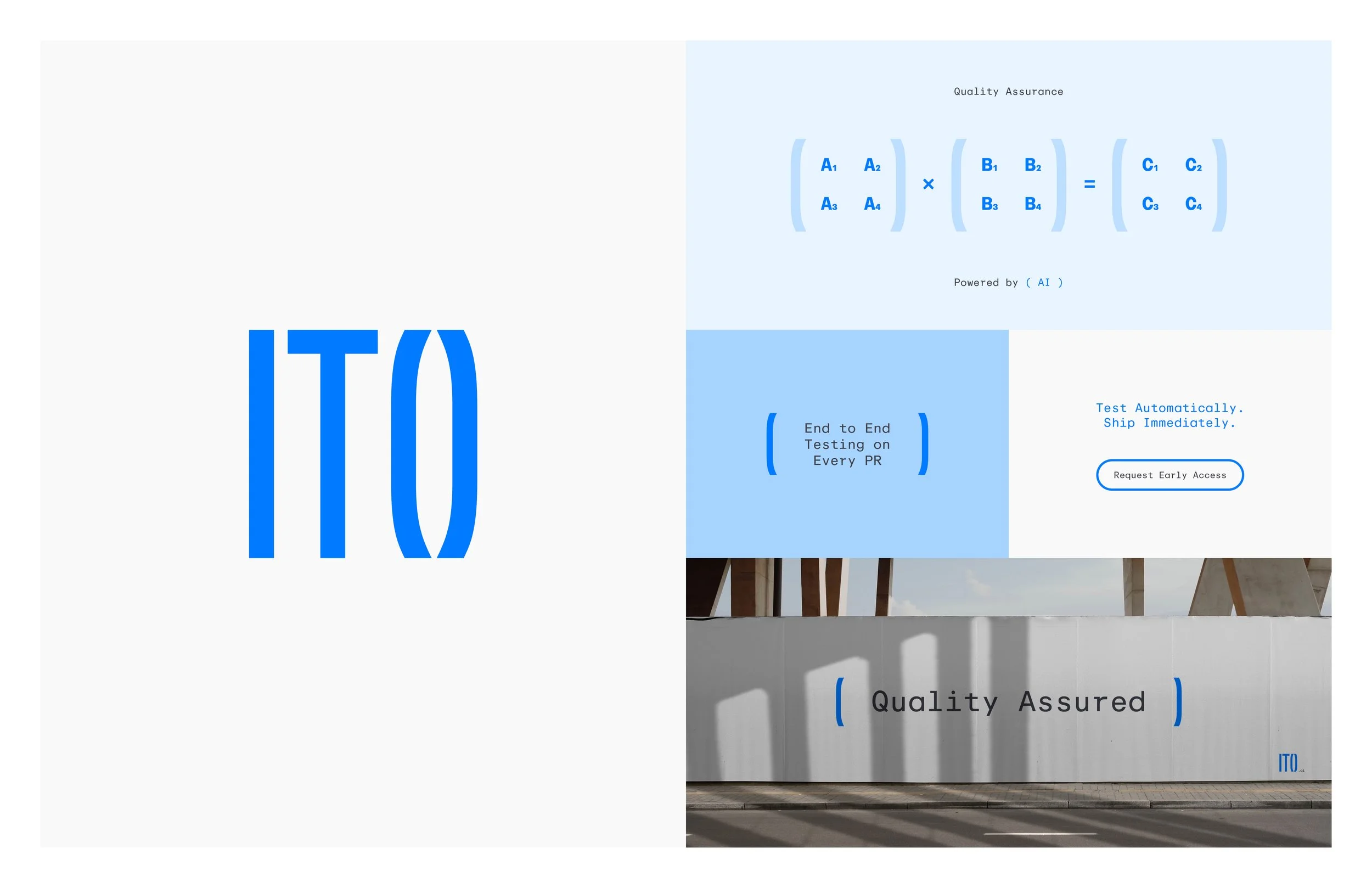
Logo and identity system for QA tech giant, Ito. The logo references matrix multiplication as the foundational computational operation powering modern AI.
Designed at
Fuller
Ito

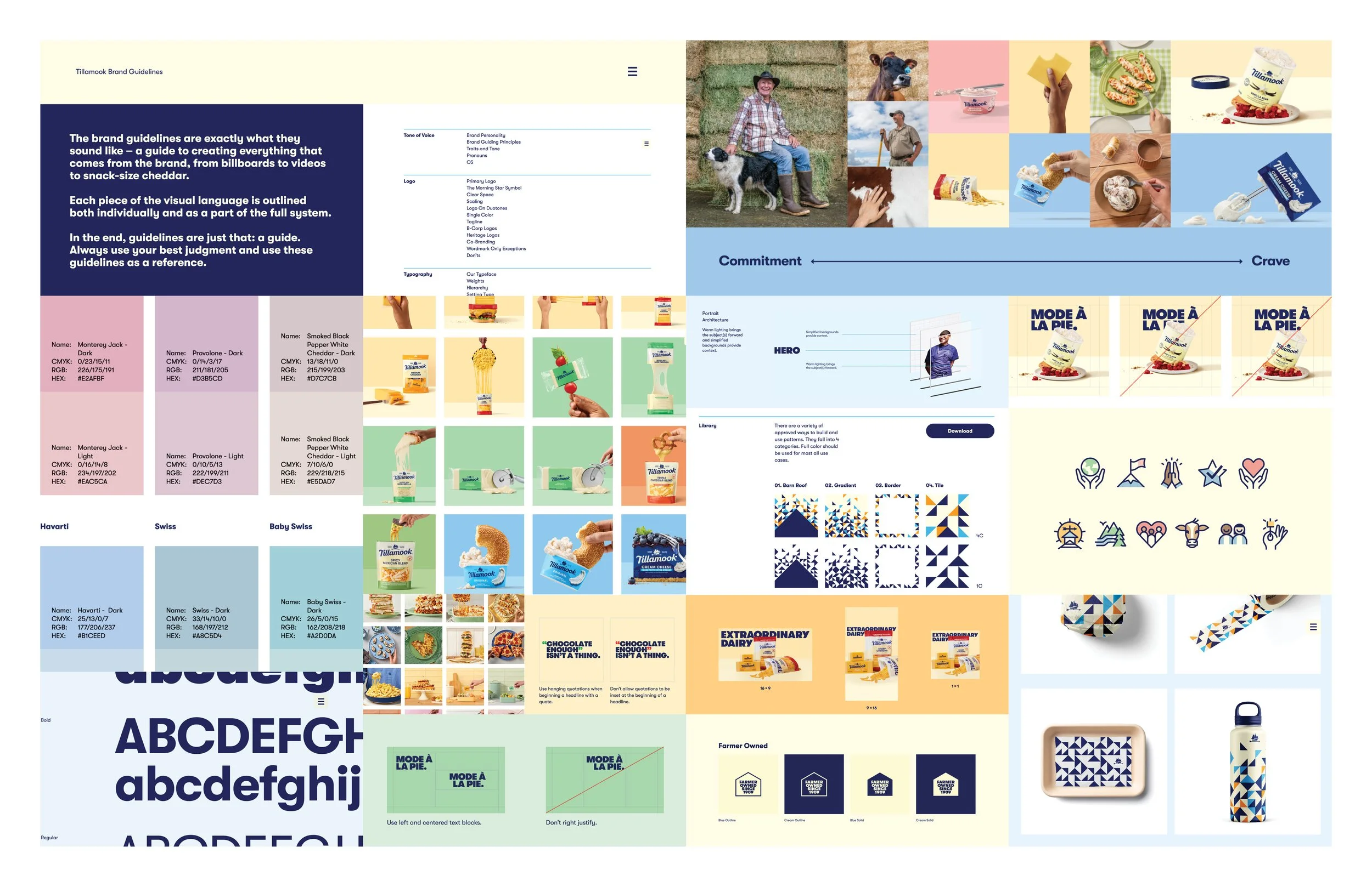
Art and Design Direction for Tillamook’s first national campaign, Extraordinary Dairy.
This includes the development of comprehensive brand standards for photography, color theory, patterns, iconography, typesetting and film treatments.
It was a privilege to work on such a uncompromising, delicious brand. Also, glad I had the opportunity to meet some cute calves in Tillamook County, OR.
Designed at
Leo Burnett
Tillamook

Art and Design Direction concept for global Samsung platform, Do What You Can’t. Embracing the idea of breaking academic design conventions.
Designed at
Leo Burnett
Samsung, DWYC

Art direction, site and launch experience for E. & J. Gallo Winery’s first brand outside wine. Yes, the now iconic High Noon began as a flavored vodka sans bubbles!
Designed at
Leo Burnett
High Noon
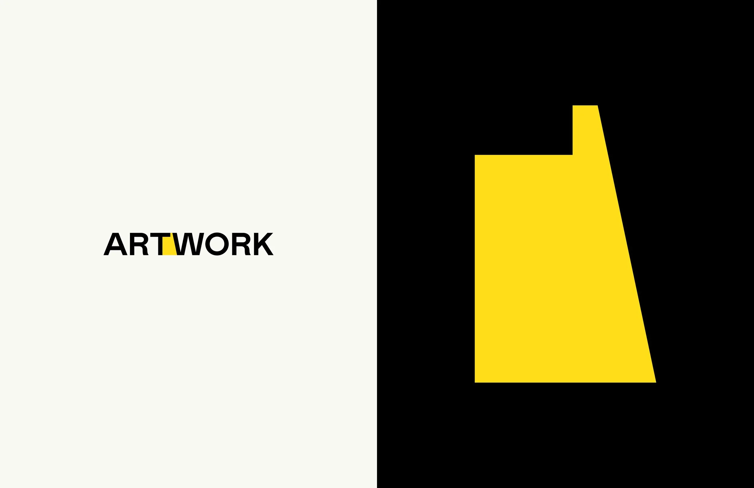
Logo for Chicago-based co-working office dedicated to those operating in that funky space between art and work. The negative space between the “t” and “w” became the mark, a sculptural form in and of itself.
Designed at
Fuller
ArtWork
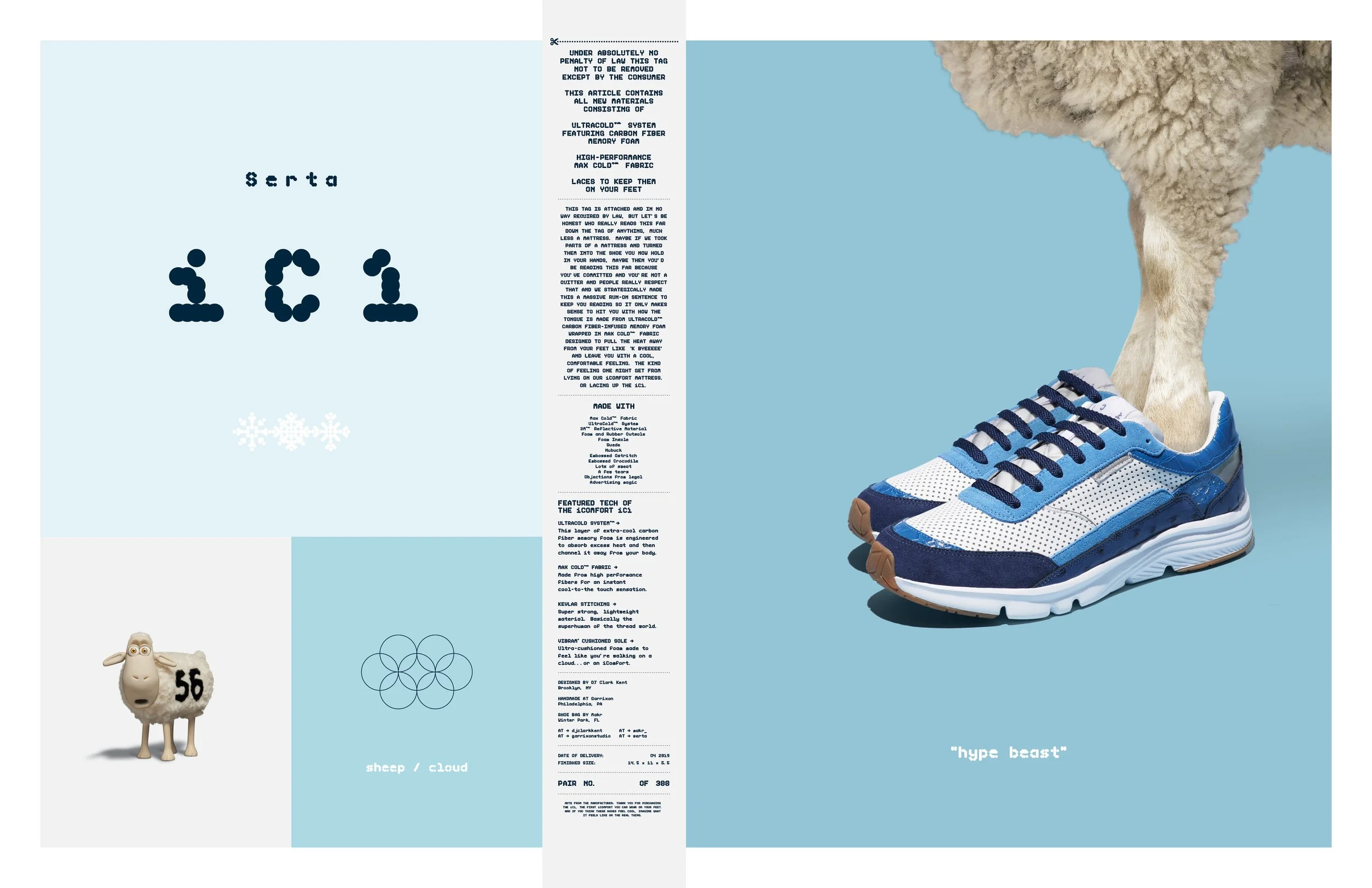

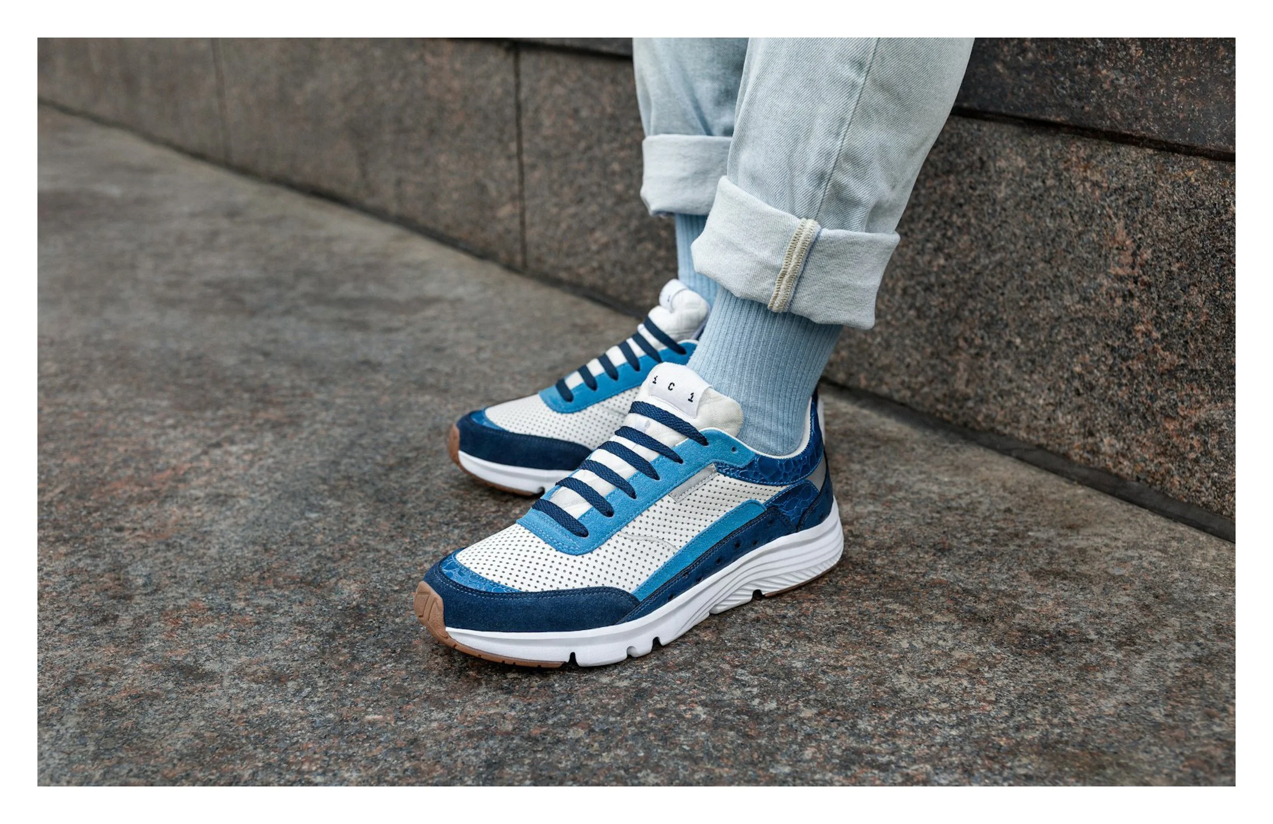
The iC1 is a mattress you can try on your feet. As a way to engage a new, younger audience we created a custom sneaker using the performance materials from the Serta iComfort mattress.
We also created a unique brand visual identity for the product including a custom typeface called Ovis and a “counting sheep” inspired bag with numbered edition livestock ear tag.
Designed at
Leo Burnett
Serta iC1
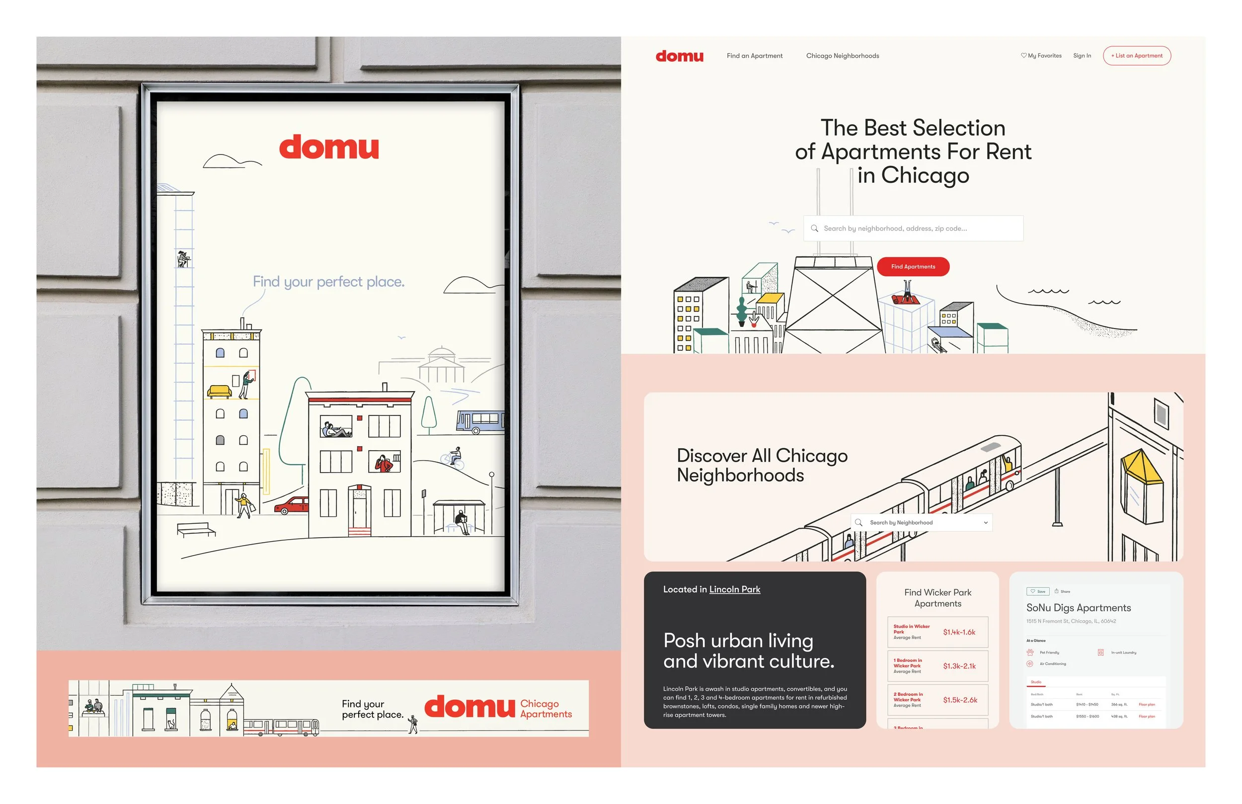
Site design for Chicago’s #1 apartment and neighborhood resource. After a successful site launch, I was asked to create a campaign that reminds us (Chicagoans) how incredible our home is. No call to action. Just a celebration of neighborhood culture.
Illustrations by the brilliant, Morgan Ramberg.
Designed at
Fuller
Domu
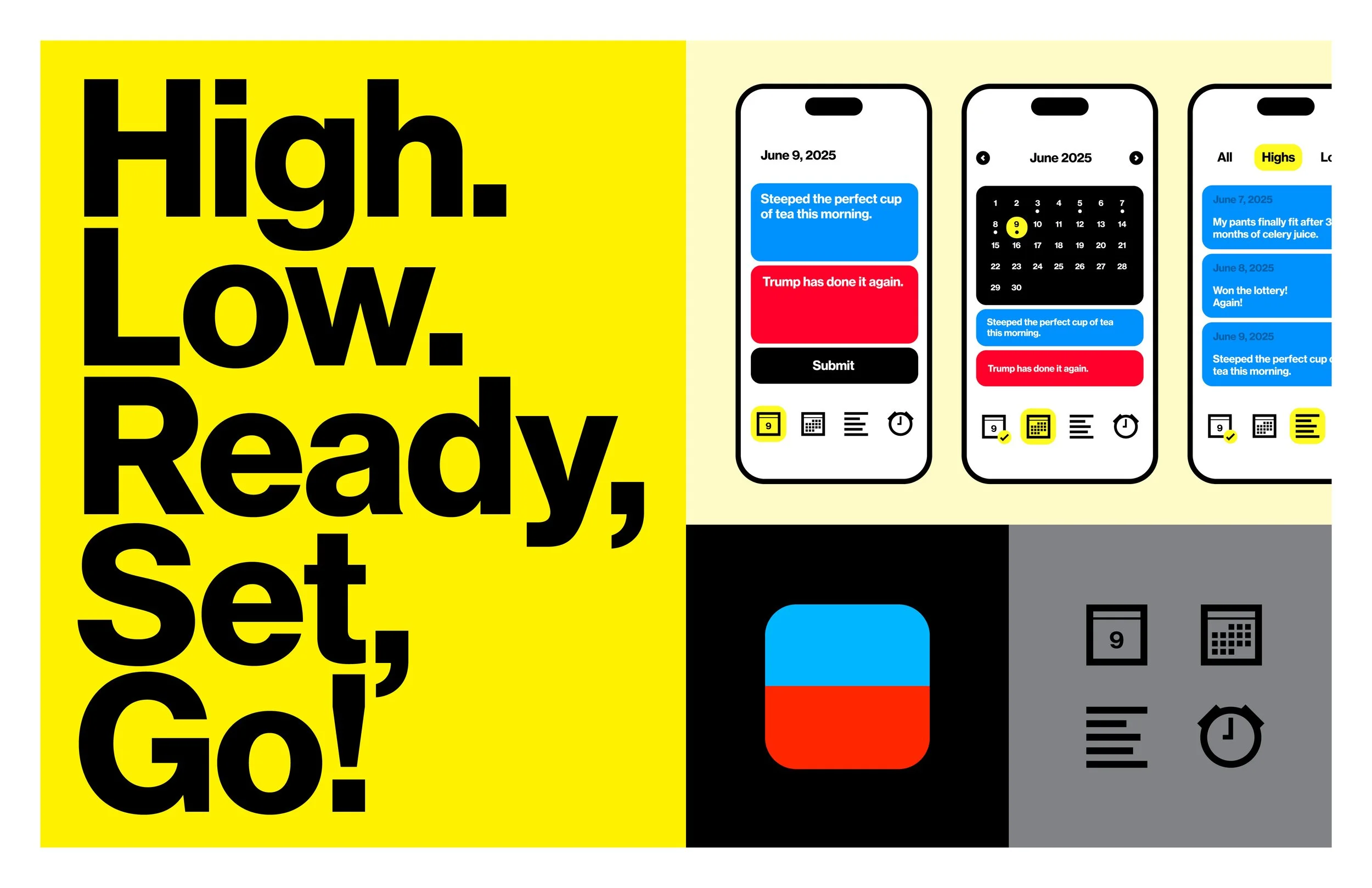
Highs & Lows™ is an iOS app that allows people to document and reflect on their day in a simple way. Hundreds of events that inspire a range of emotions and feelings fill our days. The app encourages people to consider their day in a direct and thoughtful way by distilling down those events and pulling out two simple points that sum up the extremes in a balanced entry.
Highs & Lows™ considers that we experience points in our day at each end of the spectrum, and those points have sources. After a month of using the app, one could look back in the list view and scroll through all their highs to think about what, if anything, they had in common. Was there a situation, person or place that was involved in most of them? How do they bring more of that common thing into their lives? Or how do they limit the instigator of the majority of their lows?
Designed at
Fuller with Jessa Fuller
Highs & Lows
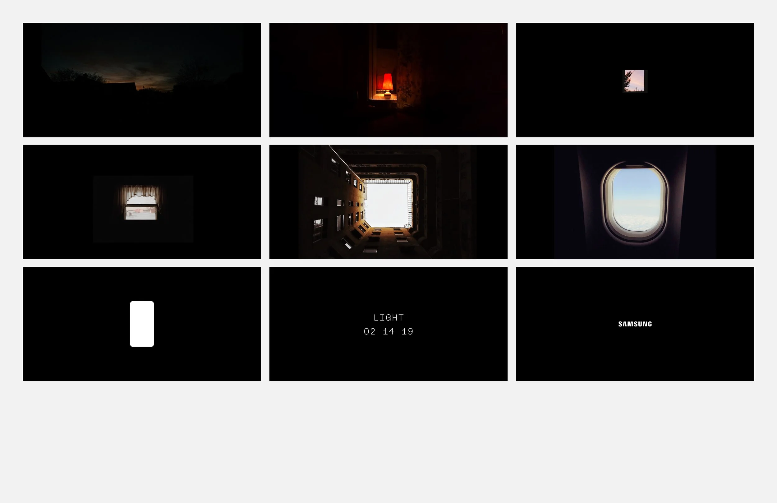
Video teaser concept for the launch of the 9 focused on the incredible camera performance in both low and high light. A stop motion sequence takes you through a full day of light from the perspective of various windows until you land at the silhouette of the glowing 9.
Designed at
Leo Burnett
Samsung
9 Teaser
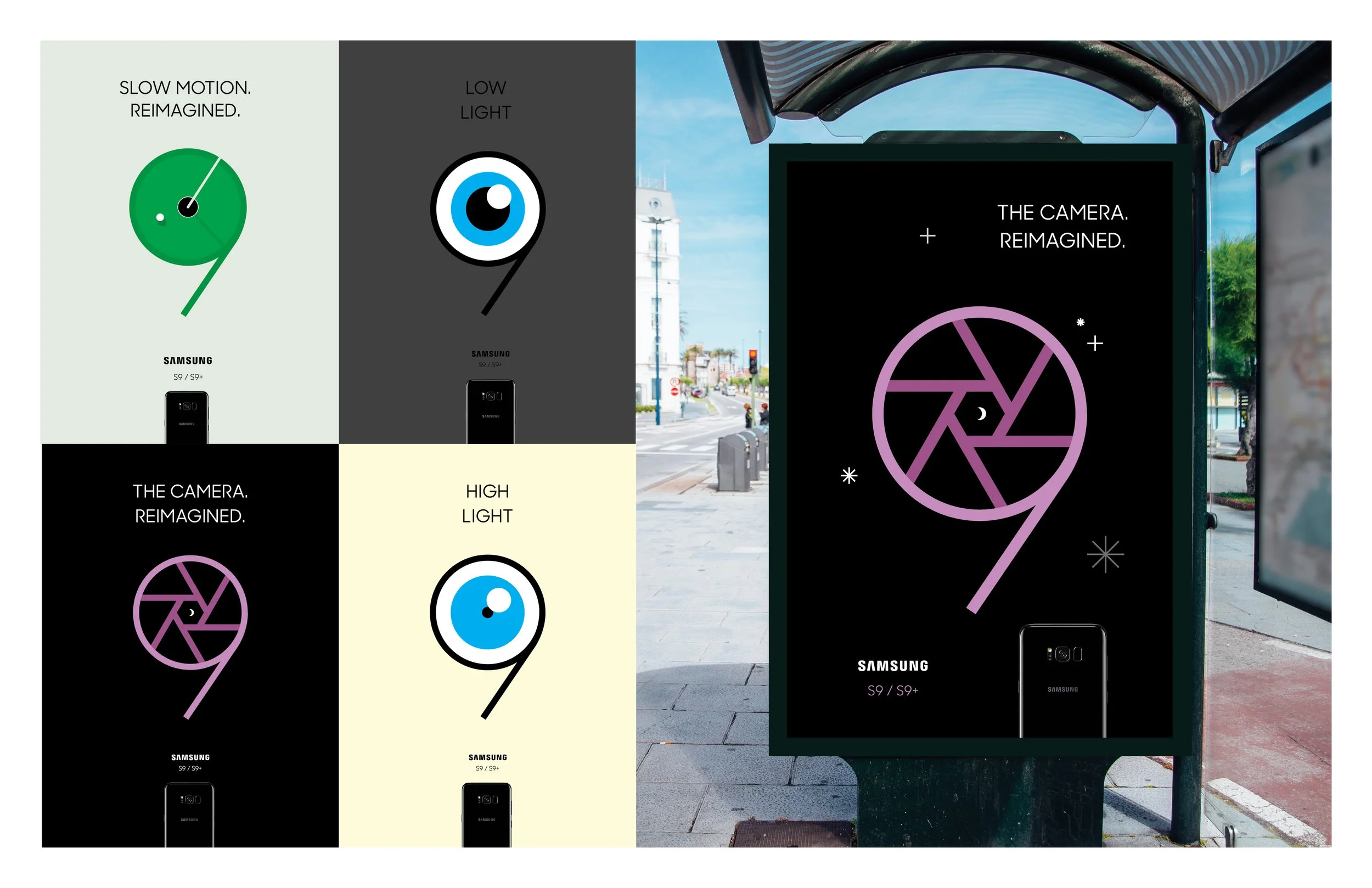
Launch concept for the 9/9+ using the counter space of the “9” to highlight new product features.
Designed at
Leo Burnett
Samsung
9/9+ Launch
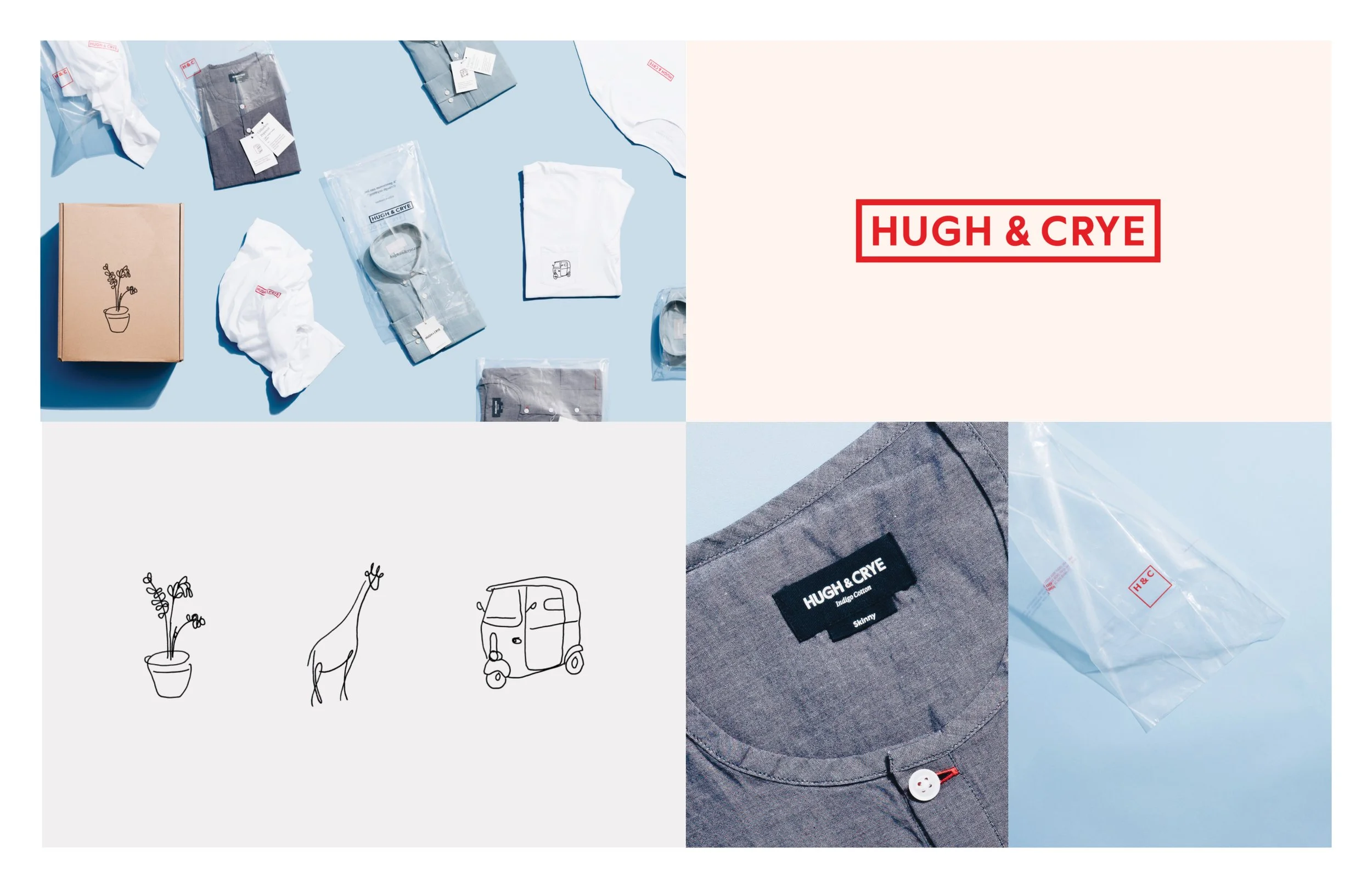
Brand identity and packaging system for menswear brand with a unique fit system that includes multiple sizes between sizes to give men of various heft and stature a more bespoke fit. The illustrations were sketched memories from the founder’s global travels.
Designed at
Fuzzco
Hugh & Crye
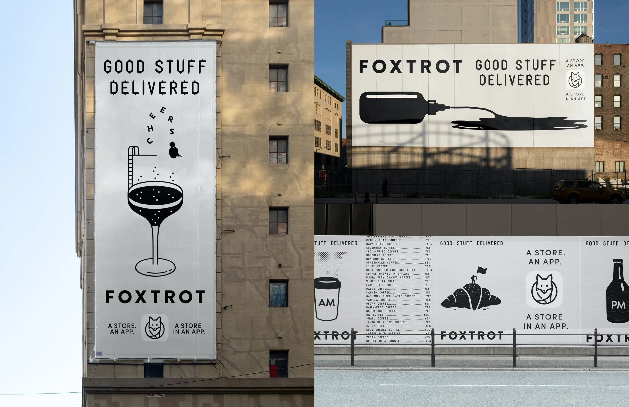
Campaign exploring the vast range of goods and services found at Foxtrot. A local, gourmet corner store with neighborhood delivery services.
Designed at
Leo Burnett
Foxtrot
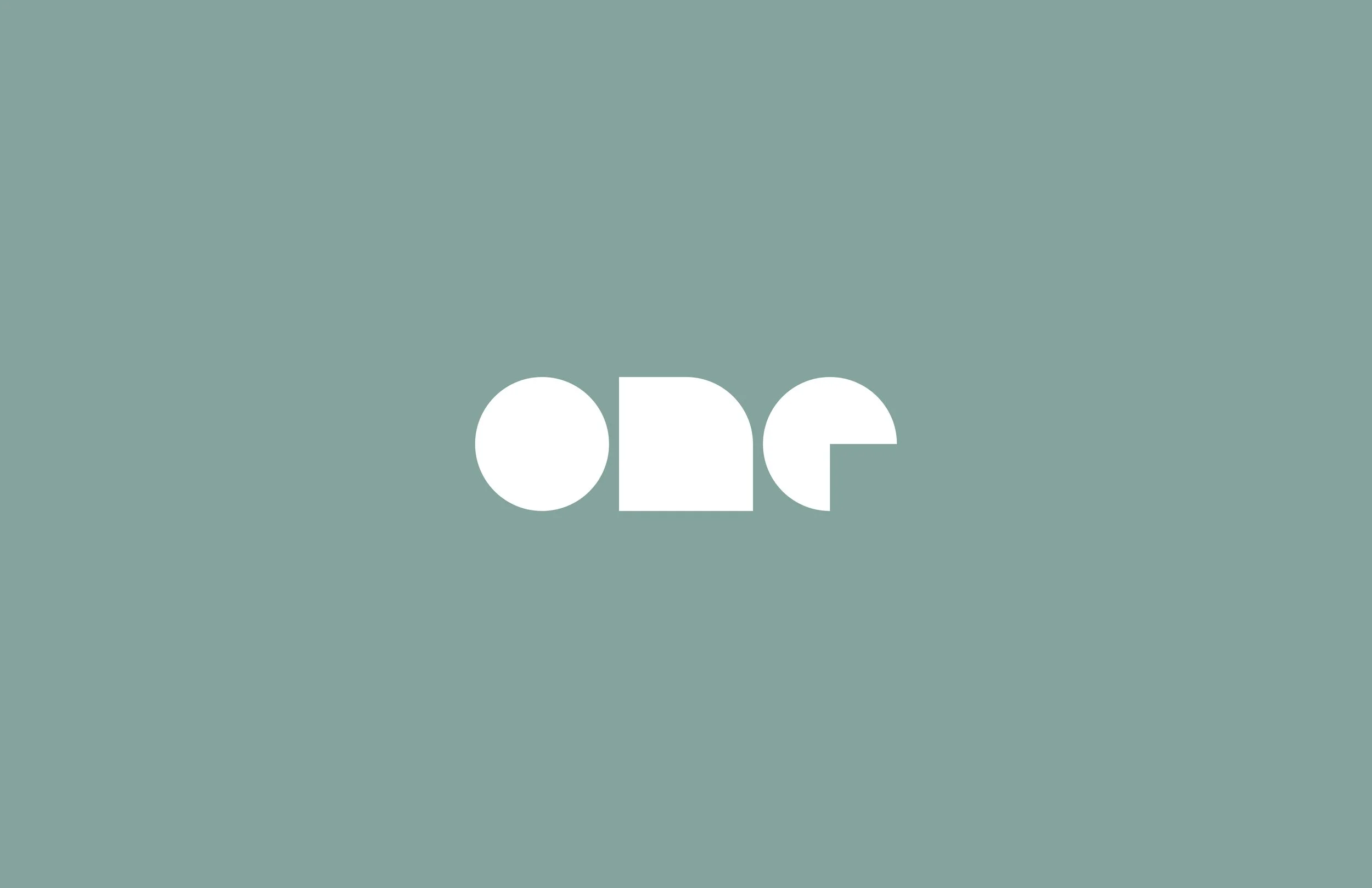
Logo for brilliant Chicago-based design firm, One Design Company. Based on primary geometric forms with endless flexibility. Now celebrating 20 years!
Designed at
Fuller
One Design Co.
Logo for LA fashion brand, The Five Nine. Celebrating those who work outside of the 9-5. The 5-9ers if you will. The mark is built from hands positioned at 9 and 5 creating a dimensional space.
Designed at
Fuller
The Five Nine

Launch concept for the 10 featuring the all new stylus. All that power in the palm of your hand.
Designed at
Leo Burnett
Samsung
10
Stop motion videos highlighting a range of personalities for the mens holiday gift guide.
Designed at
Fuzzco
Bonobos
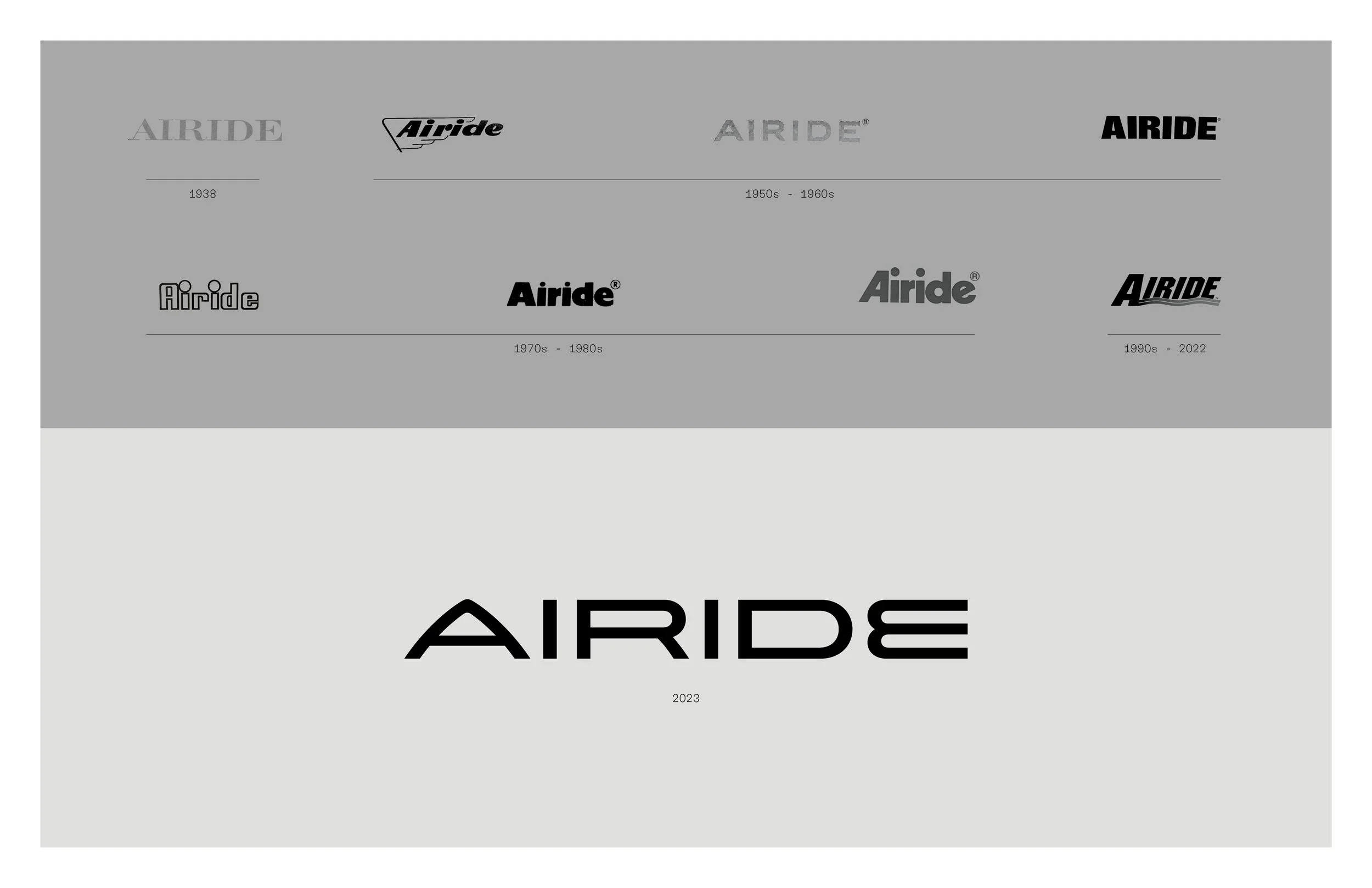
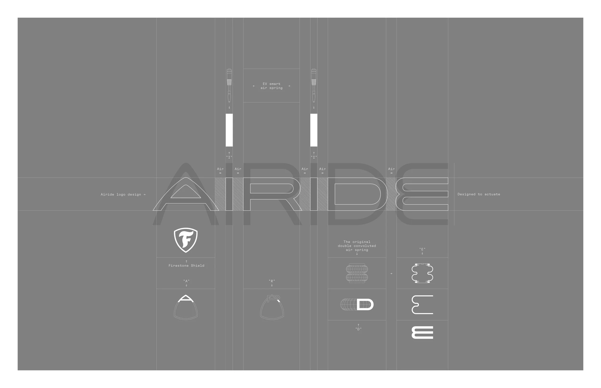
Logo repositioning an 80 year old air spring product line for the EV future.
Lettering refinements made by the brilliant Jeremy Mickel.
Designed at
Leo Burnett
Airide
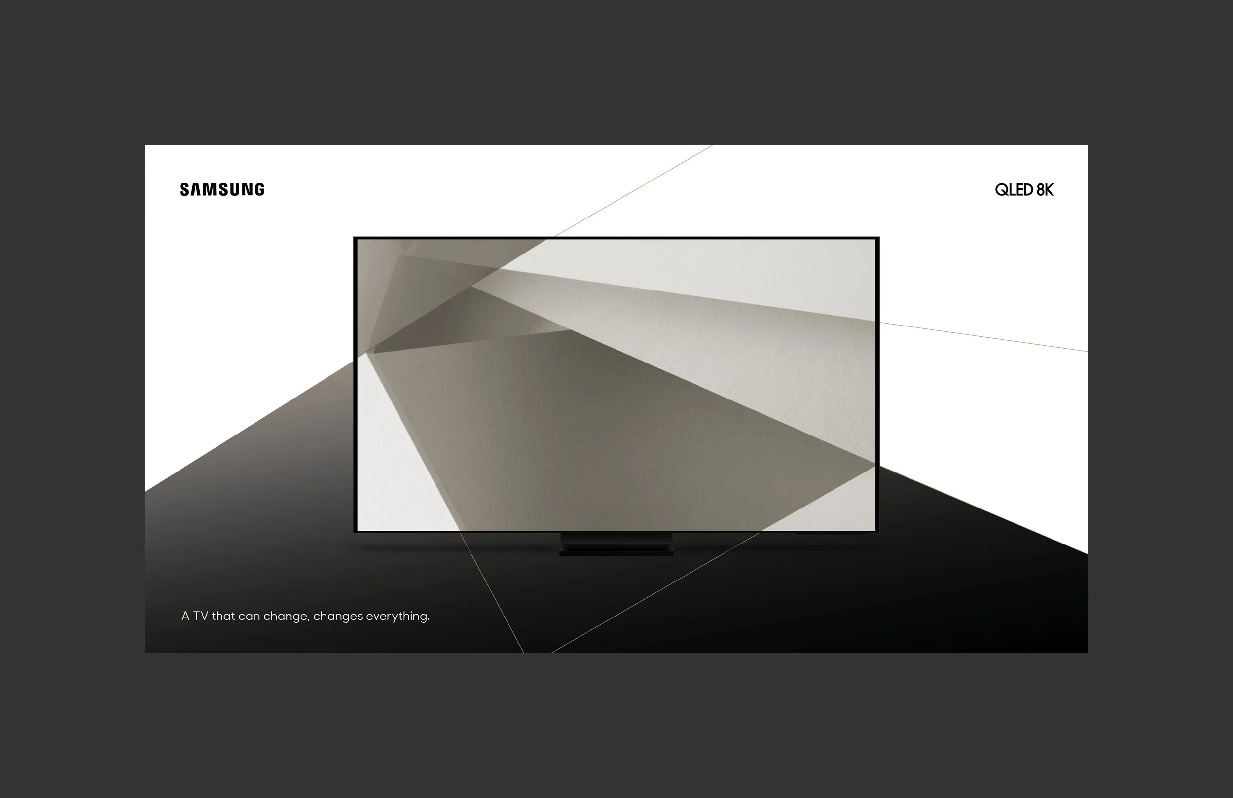
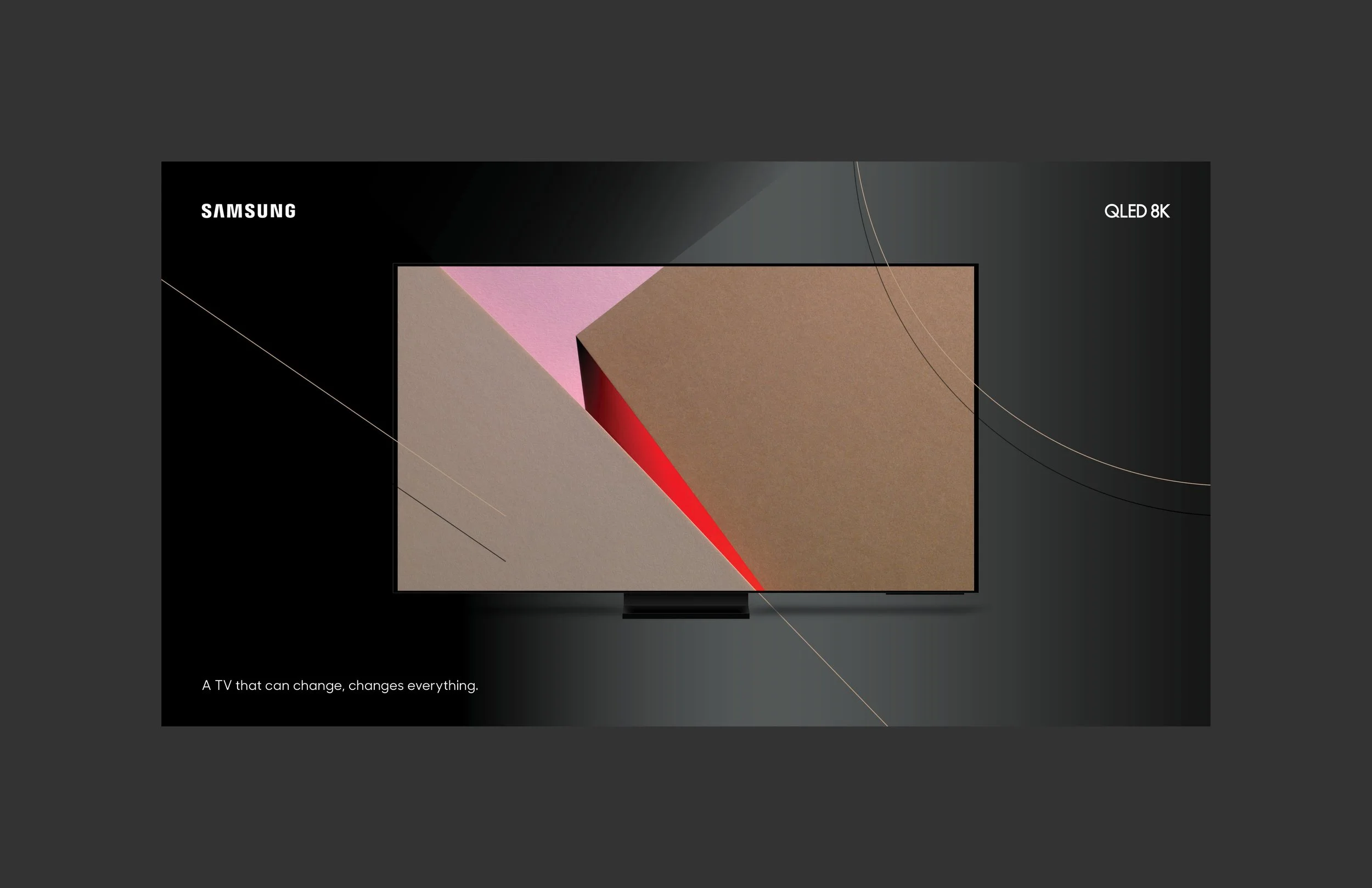
Concept art for a new, high performance tv that modifies the lighting of the environment around as the picture changes creating a far more immersive experience.
Designed at
Leo Burnett
Samsung,
QLED 8K

Rebrand concept focused on enhancing the experience of the individual, the “i” in Sprint. The yellow circle becomes a graphic device to further highlight service and customer benefits. Though this logo direction did not move forward the identity system surrounding it was applied to the retail environment. This includes the development of Sprint Sans by Christian Schwartz.
Designed at
Leo Burnett
Sprint
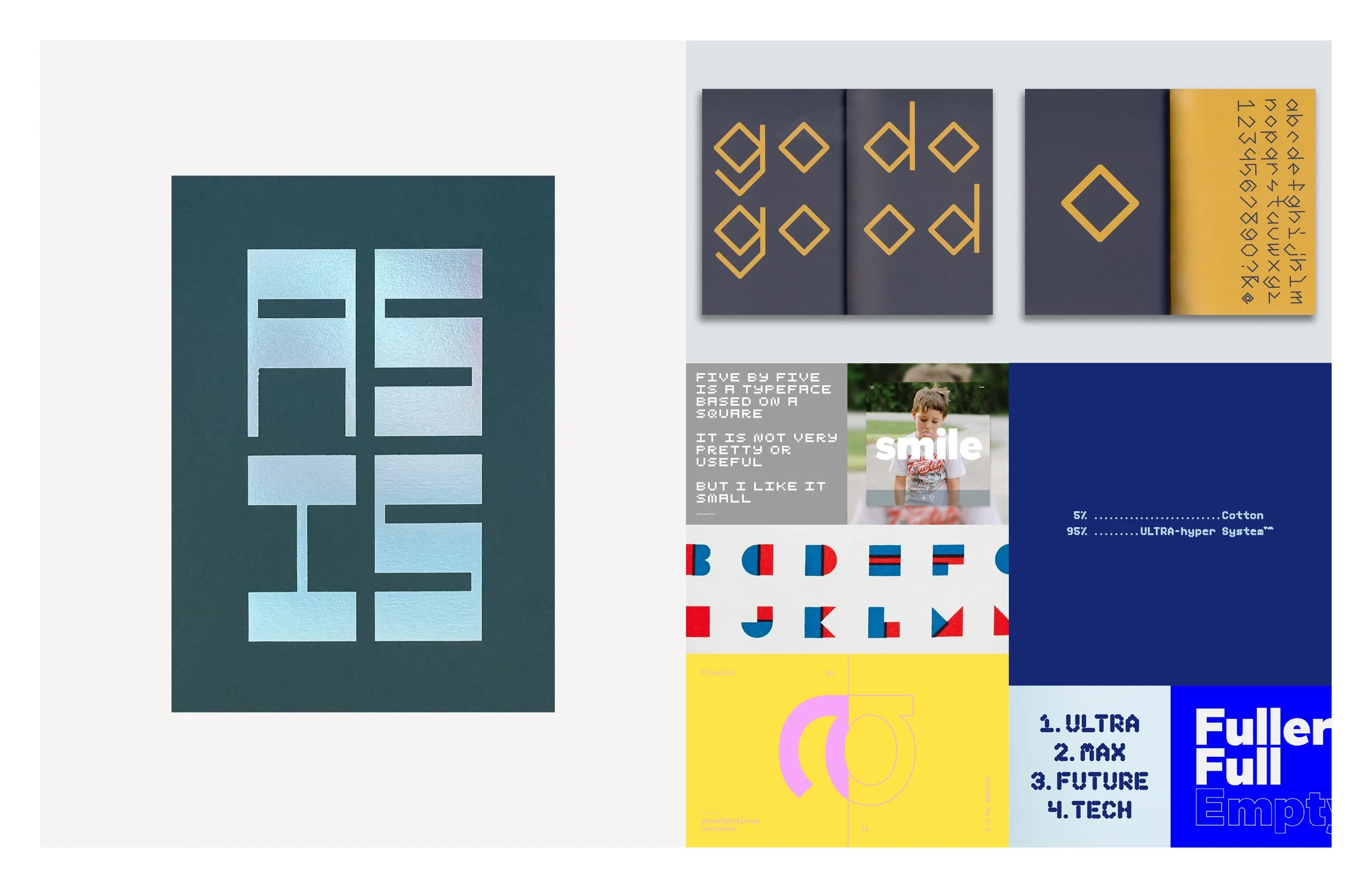
Lettering and typeface design for publications, client projects and personal use. Featured: As Is, Bort, Ovis, 5x5, Alphablocks, Pinopolis and Fuller. There is a clear geometric theme happening here.
Designed at
Fuzzco, Leo Burnett and Fuller
Type Design
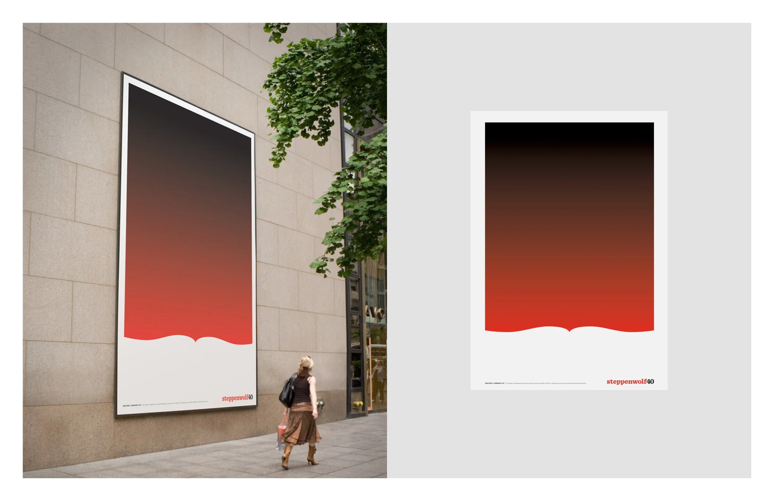
To celebrate Steppenwolf Theater's 40th year in operation, Ogilvy Chicago asked a number of artists and designers from around the world to submit conceptual interpretations of their favorite play. I loved Farenheit 451 as an angsty teen. Excited to see how I could distill such a layered story.
2016 Clios Shortlist
Designed at
Fuller
Steppenwolf
Theatre

Art and design direction for UPS’s first global advertising campaign, We Love Logistics. The core of the campaign was a series of iconographic hearts communicating the company’s logistical prowess. Because the platform was so technical and global, icons felt like the best solution to clearly connect with a wide ranging audience.
Designed at
Ogilvy
UPS

Identity for global co-working SAAS giants, Deskpass. Connecting the two ascending strokes in “desk” to make a “desk” just made sense. This flexible, modular “desktop” was used to then define an iconography set and language principles using an underline.
Designed at
Fuller
Deskpass

Pattern design collections for modern home goods heroes, Unison. Explored themes derived from Bauhaus design theories and the Memphis art movement. Explored tons of color iterations, product applications and complimentary art objects.
Designed at
Fuller
Unison
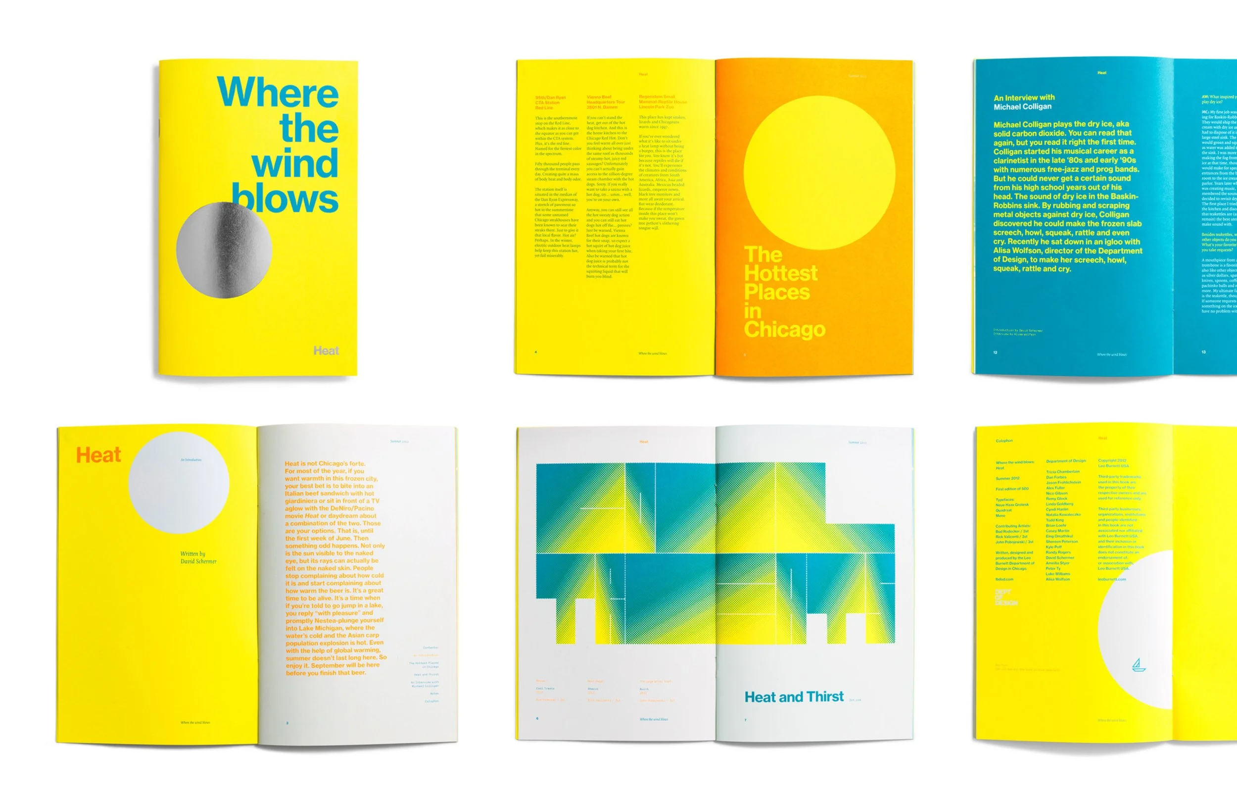
Heat was a self-initiated project to promote the new Leo Burnett Dept. of Design at the 2012 AIGA members meeting.
We wanted to build off a past project, Where the Wind Blows — An A–Z guide to Chicago — originally produced for the HOW conference the previous year. For the AIGA members meeting this summer we decided to build on the guide concept and explore a seasonal theme for our city. "Heat" is a locals guide to all things hot in Chicago.
Special art submissions from Rick Valicenti, Bud Rodecker and John Pobojewski of Thirst. Designed with Alisa Wolfson at the Leo Burnett Dept. of Design. Copy by David Shermer.
FPO Winner
Offset: Book for Self-Promotion by Leo Burnett Department of Design
Blogged at FPO, It's Nice That, Gridness
Communication Arts 2013 Typography Annual, Brochure Winner
Selected for Chicago Design Archive
Published in Victionary: Heat
Designed at
Leo Burnett
Where the Wind Blows, Heat
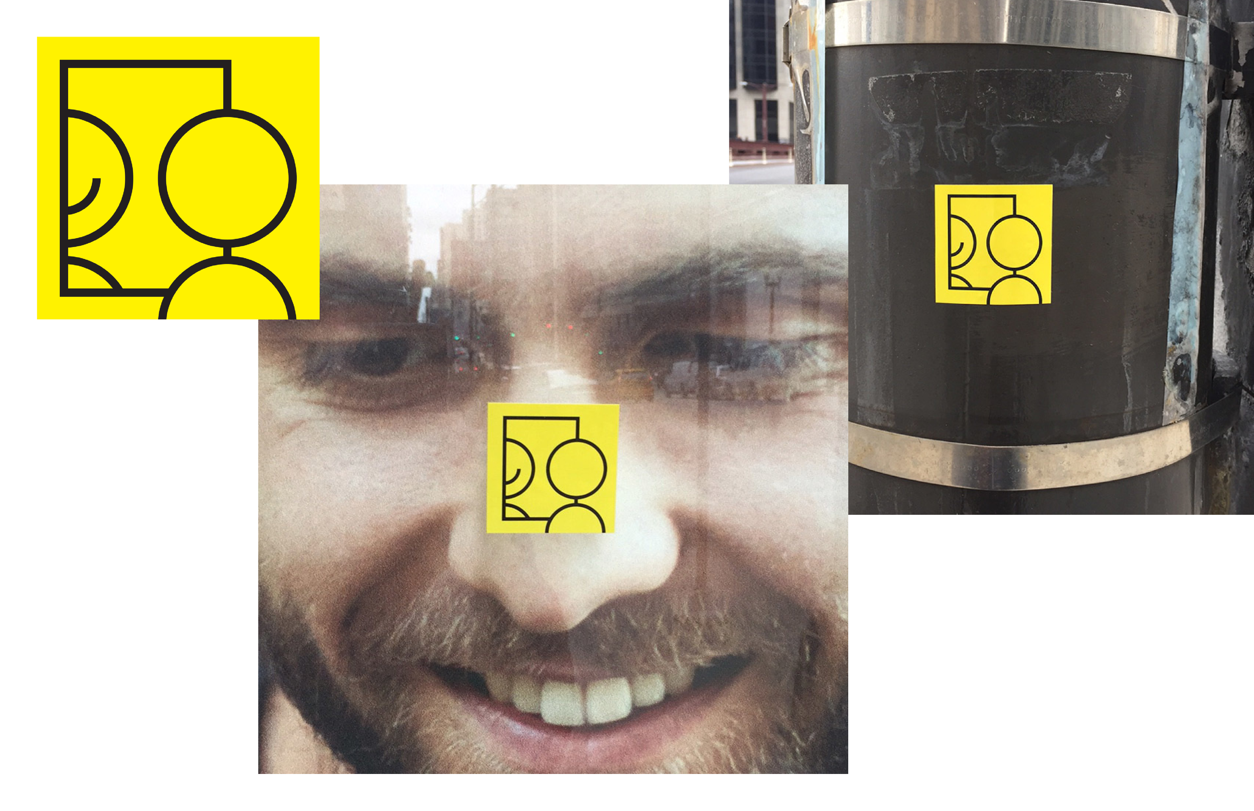
I love the 'You Are Beautiful' campaign. It's a distilled, powerful statement that fuels self-confidence. I challenged myself to create an image that embodies the sentiment of the campaign without using the ever-present headline. I chose to build a composition of a person smiling in the mirror resembling something of a daily affirmation. I also took aesthetic inspiration from the ubiquitous 'yellow smiley face'. I hope it puts a smile on someone's face!
#yabsticker
@yabsticker
Featured in The Smile Book
Designed at
Fuller
You Are Beautiful,
Artist Edition
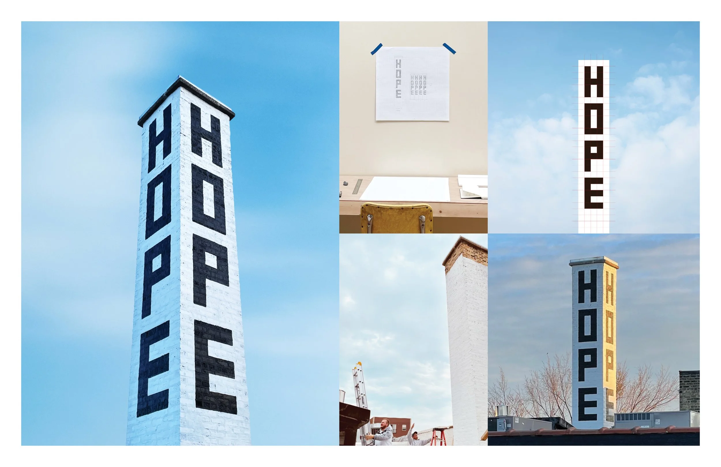
“High Hopes.” 4 words installed on the highest point of @kimballartschicago. A beacon of optimism curated by @johallaprojects.
My Fall residency at Kimball Art Center was an amazing experience that gave me the opportunity to create site specific works of all shapes and sizes in and around the building.
Designed at
Fuller
Kimball Art Center,
Artist in Residence

The average cost of college in the United States is $35,720 per student per year. Let's say you take four years to graduate—now COLLEGE means $142,880. I used this information to create an updated version of the iconic ‘Animal House Sweatshirt’ by swapping "COLLEGE" for "$142,880."
Visitors to thecollegesweatshirt.com purchased a sweatshirt to support student debt reform. All proceeds were donated to @debtcrisisorg - The Student Debt Crisis Center (SDCC) centers the needs and voices of borrowers and partners with allies to impact public policy and end the student debt crisis. (This campaign was not sponsored by SDCC)
#studentdebtcrisis
Designed at
Fuller
College Sweatshirt


In order,
Side side tables,
A series of typographic side tables designed for the annual experimental type competition, Typeforce.
The HumanKind chair,
HumanKind is a Leo Burnett philosophy. The advertising giant commissioned me to create a piece of art to celebrate this idea. The capital 'H' and 'K' are represented in 2 distinct profiles. All built to human scale.
The One Two Three bench,
The One Two Three was conceived as an adaptation to the classic Nelson Bench with the addition of new functions and storage. Built with only 1x1, 2x1, and 3x1 inch slats, each proportion was given a defined use: 1x1 for lighter storage, 2x1 for sitting or primary storage and the hefty 3x1 for primary structural support.
The One Two Three functions as a bench but also serves as a coffee table with removable coasters that slide into the surface slats. The uneven surface is now multi-purpose.
Designed at
Fuller
Furniture
Thanks for dropping by.
Thanks for dropping by.
Feel free to reach out.
I love a good chat!